

WIDE BAY HEALTH REBRANDING PROJECT
As part of a University assignment, I worked a graphic designer with Christina Kranenfield and Ashton Cartner, and our project manager is Liam Sharples. We worked as the team ‘Design and Creativity’.
We had the project of redesigning a logo for the Wide Bay Health and Hospital Services. We worked closely with their director of communications, Jessica Barr and their graphic designer, Aimee Courtice.
The goal of our project was to give WBHHS a fresh and modern rebrand with a more contemporary logo that better represents the organisation today.
We aimed to unify the branding to be inclusive of all the wide bay local communities to improve recognition and consistency
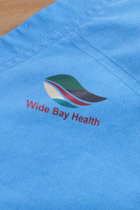

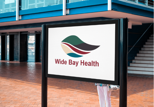
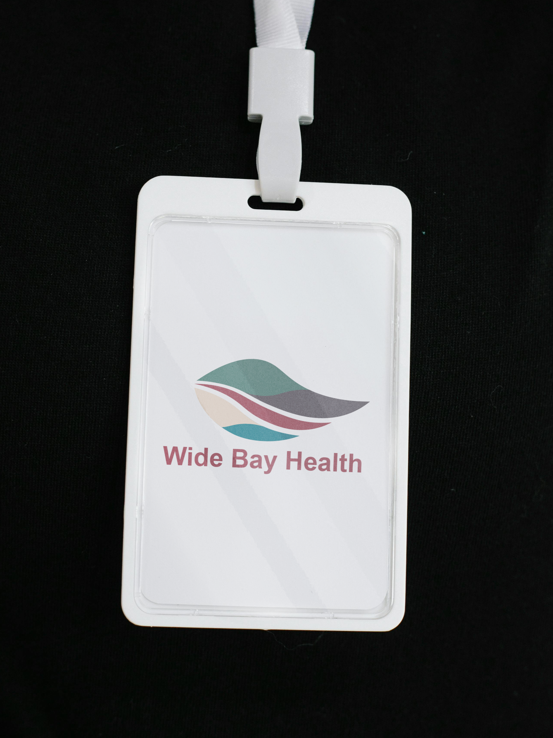

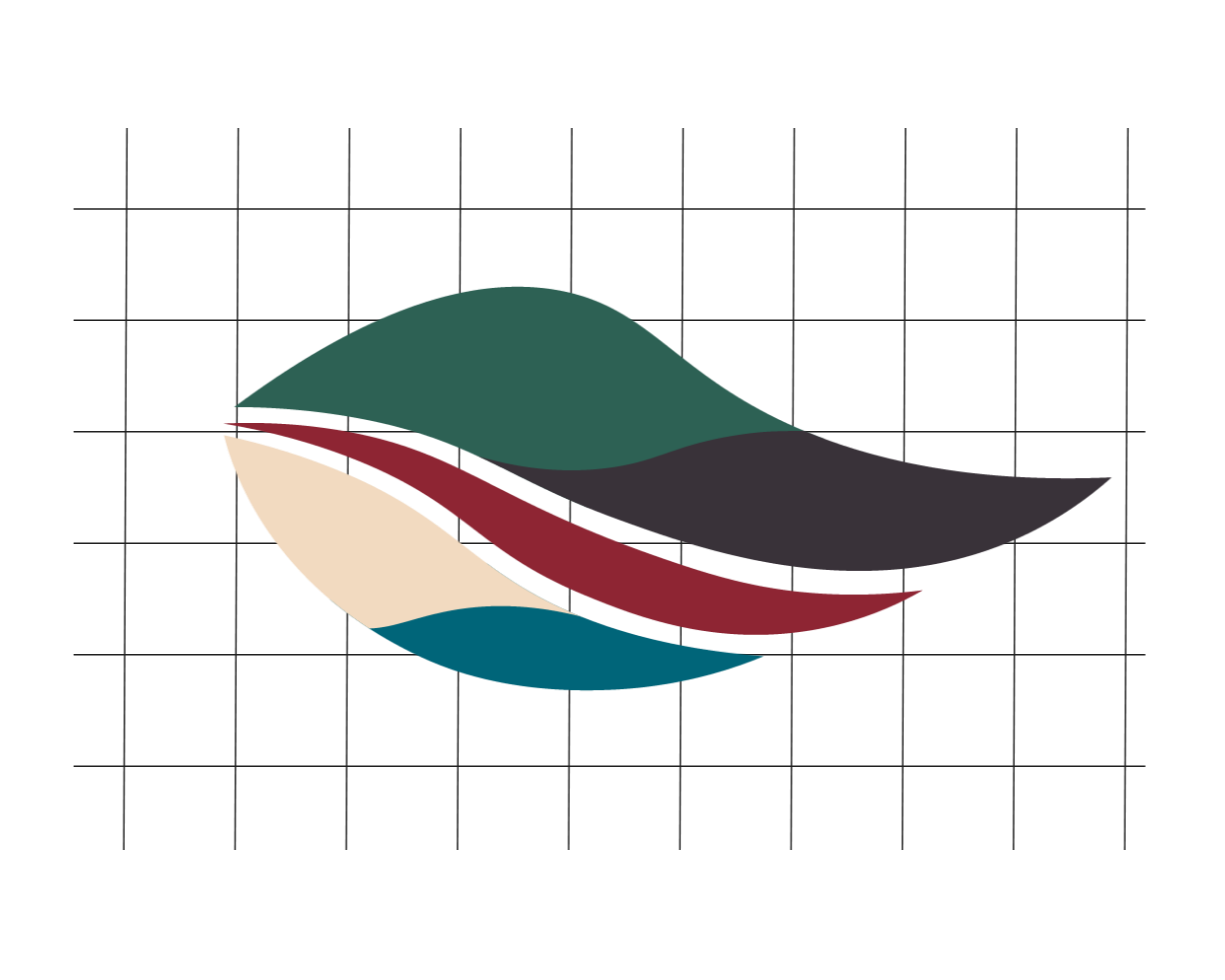
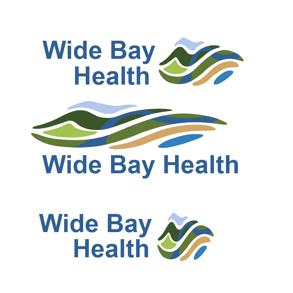
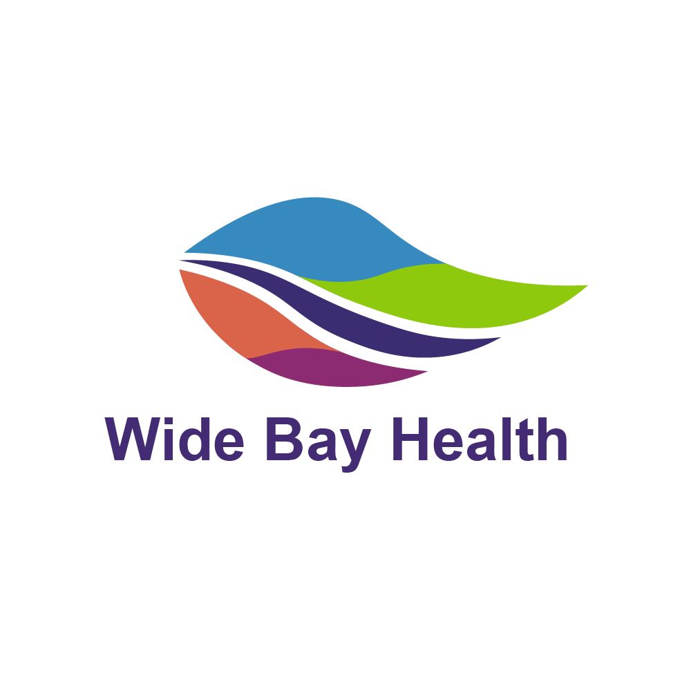
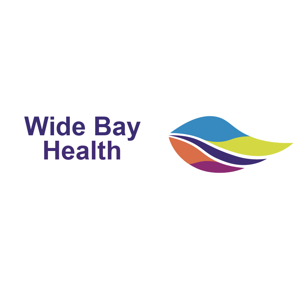
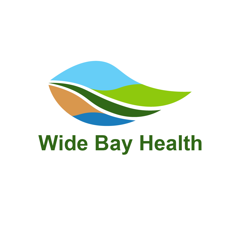
FINAL LOGO
The final logo chosen by the Wide Bay Health representatives was this design I created.
I focused on developing a colour and style that reflects all the different regions of the area.

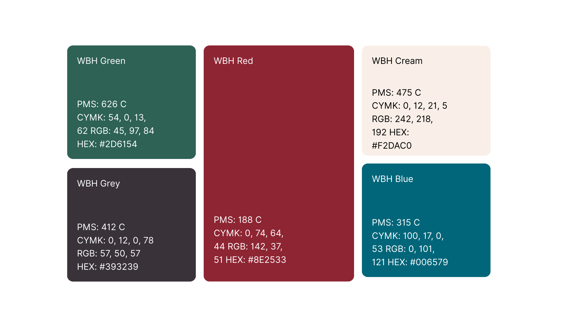
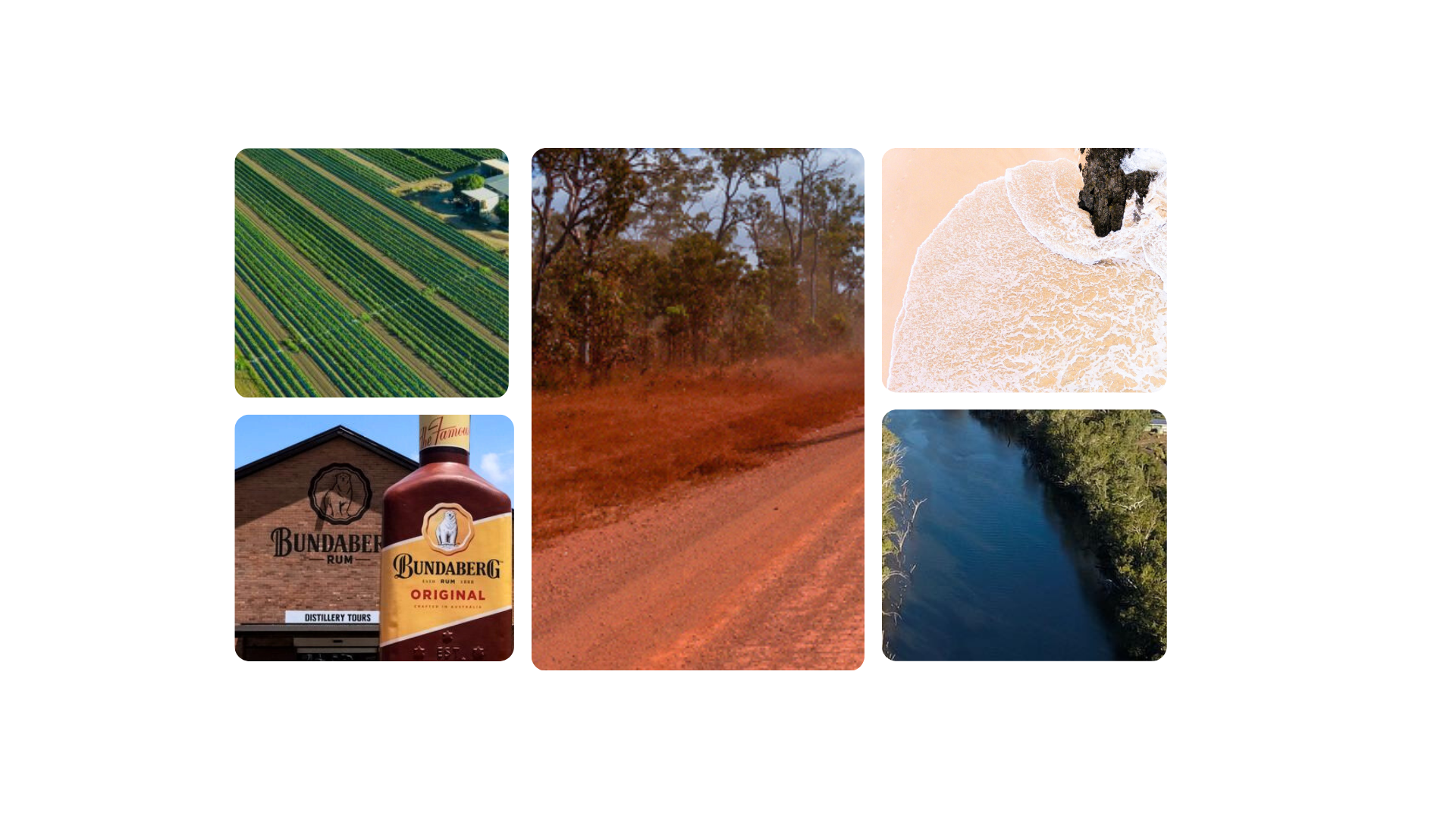
Colour Palette
The colour palette was chosen to represent the various regions of the Wide Bay area, focusing on agriculture and farmland (green), heritage (black), waterways (blue), beaches (cream), and the country and soil (red).


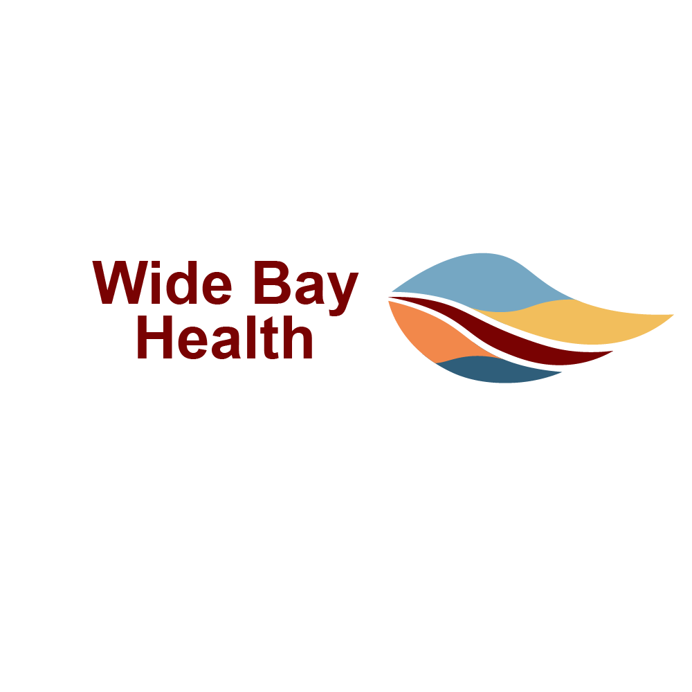
ALPHA DESIGN


POST ALPHA DESIGNS
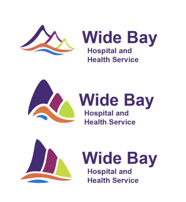


BETA DESIGNS


Client FEEDBACK
“Working with the ‘Design and Creativity’ team has been a great experience
for us here at Wide Bay Hospital and Health Service.
When we initially considered a new brand and design for the health service,
we realised it was beyond the scope of our small team.
We saw a partnership with CQUni as a great opportunity to build capacity in
our local region, strengthen ties with the University, and partner with a great
group of passionate students,
We’ve been delighted with the process, and really grateful for the support from
the unit supervisors. The students have done a great job and they should be
incredibly proud of the product they’ve developed.”